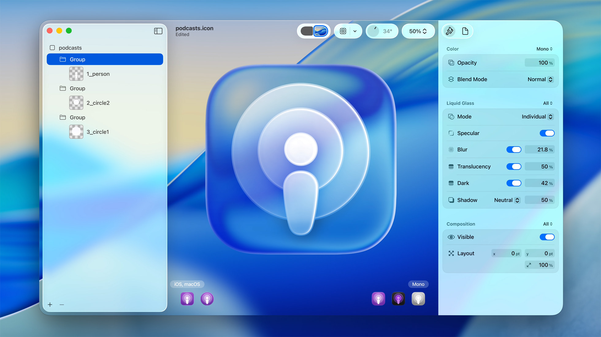
Apple’s Liquid Glass design isn’t just another aesthetic cycle—it’s a quiet rebellion. In a world where interfaces flattened into sameness, where everything became predictable grids and sterile geometry, this shift feels almost like a reawakening. Shadows return, reflections breathe, and surfaces feel less like barriers and more like transitions.

It’s an era of rediscovery, but not the kind that clings to nostalgia with desperate fingers. It acknowledges the past—fragments of macOS Aqua, the ghost of skeuomorphism—but doesn’t linger there. Instead, it refines. It learns. Much like the way Frutiger Aero once wove vibrancy into Windows’ digital landscape, making screens feel like physical spaces rather than just functional windows to code, Liquid Glass introduces an organic motion that isn’t merely ornamental. It allows depth to be dynamic, for light to shift as if technology had texture.
For those who remember interfaces with weight—when buttons felt pressable, when movement didn’t just animate but responded—the return of fluid design feels like an unspoken nod. But for a new generation raised on stark contrast and ruthless simplicity, this is something entirely new, unfamiliar in its softness. It’s less about looking sleek and more about feeling lived-in.
And that’s the core of it—what makes this shift more than a cosmetic update. It’s an embrace of fluidity, where design isn’t just about static perfection but about letting things exist in a natural state of change. Whether that’s unsettling or mesmerizing depends on who’s looking.


